Tab
Controls the display of tab color, font, highlighting, optional icons, tab width and tab title
Section titled “Controls the display of tab color, font, highlighting, optional icons, tab width and tab title”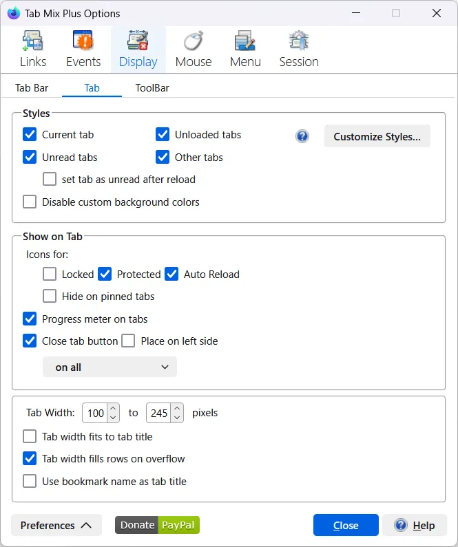
Styles
Section titled “Styles”Highlight (select one or more options) - customized style will be applied to the designated tabs
-
Current tab
-
Unread tabs
- set tab as unread after reload
-
Unloaded tabs
-
Other tabs (tabs that have been viewed)
-
Disable custom background colors
-
Apply background color for squared tabs
Read Customize Styles section below for instruction how to customize tabs style.
Tabs background colors may not display properly when TreeStyleTabs is installed.
Show on tab - Icons for
Section titled “Show on tab - Icons for”-
Locked
-
Protected
-
Auto-Reload
-
Hide on pinned tabs - check to hide all icons on pinned tabs
-
Show Progress meter on tabs
Read Customize Styles section below for instruction how to customize Progress meter color. -
Show on tab - Close tab button Select which tab(s) rules are to be applied (select one):
- on all
- on all tabs wider than (set size)
- on current
- on pointed for
- on current and pointed for
- Place on left side
Tab width
Section titled “Tab width”- Tab width (specify range) default: 100 to 250 pixels:
- Tab width fits to tab title (the tab will be sized to fit the title - not recommended for tabs under 100 pixels)
- Tab width fills rows on overflow, available only when
Tab width fits to tab titleis disabled, tabs in multiple rows will be sized to fill all empty space in the row - Use bookmark name as tab title (the bookmark name will be used for the tab title)
Customize Styles
Section titled “Customize Styles”Click on Customize Styles button to open Customize Styles editor in a separate dialog. The dialog contains five panels: Current tab, Unread tabs, Unloaded tabs, Other tabs and Progress meter on tabs.
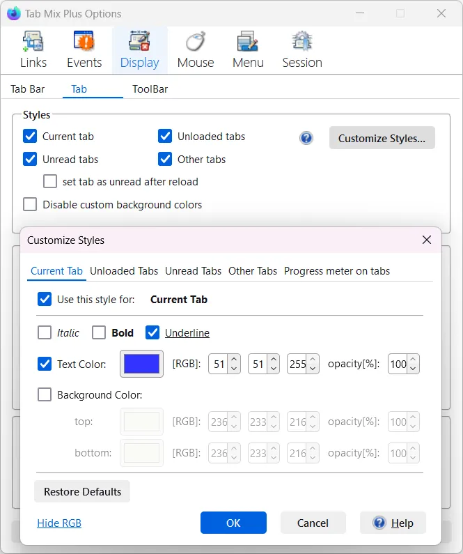
- Use this style - enable/disable specific style, same as changing one of the appropriate options (listed above) in the main dialog window
- Italic
- Bold
- Underline
- Text Color: select color and specify opacity
(100%) - Background Color: select color and specify opacity
(100%) - Restore Defaults (resets specific style to default)